Well I'm using my scientist brain to improve my artist brain!
Up until now I guess I've been buying paint tubes based on their shiny-ness, because other artists metion they use them, or whether they're on offer(!).
Well no more!!
I'm using my natural scientific brain (at last the day job comes in useful for more than the bills!)
I'm studying
Suzanne Brooker's 'Portrait painting atelier' a lovely book I got for Christmas. So far I've been drooling over the masterful painting examples biding my time until I had more time to devote to artistic study (as opposed to the scientific type!). Also I've got a new digital camera (since the last broke I've been limited to what I can post)
Essentially the first exercise involves exploring the pigments on the pallete and learning control over the mixing capability of each colour.
Here's the first two using core earth red pigments and then contempory red pigments. For each I painted the the hue (colour out the tube) then experimented with tines, tints, shades, warm, cool and neutral mixes of each colour.


Doing this not only allows me to improve my colour mixing control and skill, but also allows me to directly compare different paint hues and variations between manufacturers.
I found these difficult as I have a red/green colour blind deficiency so mixing the neutrals caused me a bit of consternation (as I had to mix green into my reds to neutralise the colour)
Next up is the oranges and remaining earth colours!
Ryan


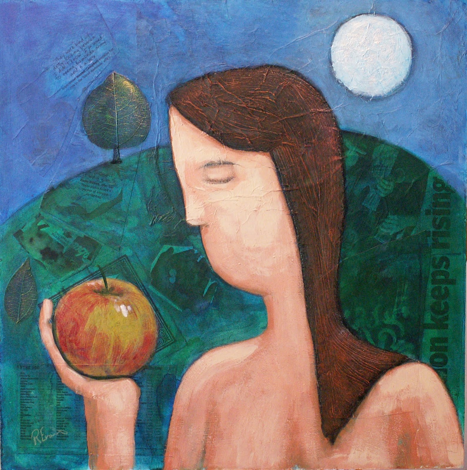 Forbidden Fruit