Saturday, March 17, 2012

Classical style drawings

Have been continuing to practice my clssical drawing techniques, here's some recent examples:


This one is from life and took about 1hr 15mins. It utilises grey paper, graphite and heightened by white chalk. There no smudging, only directional hatching to indicate form. This is a technique favoured by many of the old masters.


This one was done yesterday at the National Galleries of Scotland. There was an 'Easel Sketching in the Gallery' event that I took part in. Basically there was a model and easels set-up for volunteers to draw. Took about 20mins, but was tough because there was quite a crowd (about 30-40) bustling around watching you work!! It uses willow charcoal and white chalk on a warm grey paper. Reasonably happy with my effort considering I wasn't warmed up and was under pressure!


Finally I went to the back stair of the gallery where there are many classical Roman busts (Mix of marble and plaster casts). Picked this one to do a sketch off in my journal, using just a new mechanical pencil (HB) I bought. I really liked the fact that this pencil was always sharp! There was quite an audience again as visitors walked past, many stopped to see what I was doing and asked a few quesions. Quite a challenging afternoon!

Ryan


Wednesday, March 07, 2012

A night on the tiles

A night on the tiles


Here's a sketch of the next painting for my new mixed media style that's developing. The sketch is literally a thumnail 3.5 x 3.5 inches. It's enough to give me an idea of what the finished piece might look like.

For the sketch I use Staedler pigment liners to draw the image, this one worked first time luckily but then I have drawn my cat Baggio lots of times! By using ink, you can't erase any mistakes so makes you just go for it (its only a sketch!). Once I have the drawing down, I use Caran D'Ache Neocolor II watersoluble wax pastels to add colour. The best thing with these is they have high pigment ratio and when you get a brush with water, you get a lovely wash of pure colour to quickly indicate the colour strategy. It's still transparent so you can see the ink still too.

With this there's not much I wanted to change other than the angles of the buidings. So I got started with the painting. I start with collage to make the basic shapes and add texture. I sketch in black ink the image using the wooden end of a brush and a square cut-out of cardboard (this stops me being fussy and detailed- adds character to the drawing as its a bit wonky). Colour and paint are then built up in layers with extra colloage here and there. The cat is made up mainly of collaged newspaper!


A night on the tiles
Mixed media on board
15x15 inches

Ryan

Friday, February 17, 2012

Defiance, new portrait in pastel

Defiance Pastel on paper 12x15 inches A new portrait painting I was keen to try to capture the expression on the models face in this one. She's got a really strong defiant profile. Ryan

Sunday, January 08, 2012

Portrait swap

Karen Oil on canvas 8x12 inches For the past 3 years I've taken part in a portrait swap with other artists around the world. It's great fun painting another artist and getting a portrait in return from them. All along there's encouragement and sharing of techniques and ideas. This year I was swapping portraits with a New Zealand artist- Karen. Here's my portrait of her. Happy 2012! Ryan

Sunday, October 09, 2011

Life paintings

Wow September came and went so fast- I never posted anything. That doesn't mean I wasn't busy painting and drawing! I'm still going to my weekly life painting/drawing group at Whitespace. I'm now using acrylics to paint the long pose (about 1 hour 45mins). I'm painting on little boards only 9x12inches, to allow me get a degree of finish within the time frame. These boards (MDF from DIY store) provide a good painting surface, they need to be gessoed (3 coats) before use and I then paint neutral gray mixed with acrylic texture paste medium to provide a more interesting paint surface and to get rid of the white gesso- replaced with a midtone. Here's the one I did last week
Rebecca 9x12 inches Acrlyic on board And here is tonight's effort
Justin 9x12inches Acrlyic on board I'm using a new viewfinder that I got, It's really helping me think about the composition before I start and keeps me focussed on scale too. With many of my tutored life classes I'd done previously, there was always pressure to make sure you got the WHOLE figure in to the picture- which really hampers creative composition I feel. The viewfinder let me try out different cropped compositions to pick one that is interesting before I start. Also I'm working with a limited pallette (yellow ochre, raw sienna, burnt sienna, Burnt umber and black and white) I'm finding this works great for me creating believable skin tones and creating a moore harmonious painting. Ryan

Monday, August 15, 2011

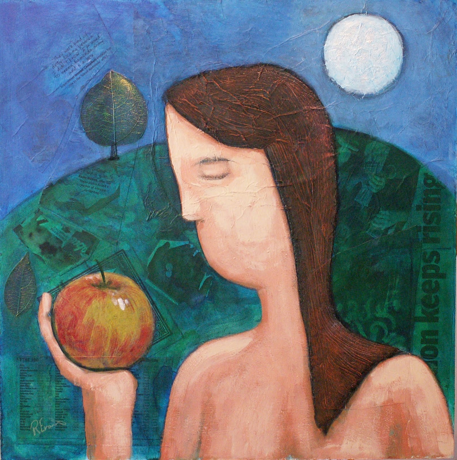
Forbidden fruit 2


Forbidden fruit 2
Mixed media on board
15x15 inches

He's the sequel to the 'Eve' painting I did. Has been on the spare easel for a wee bit while I did some oil painting studies. Finally decided to get this one done.

Here's some close-ups so you can see the textures and collage elements


Ryan

Sunday, August 14, 2011

Cast study


Cast study
pencil on paper

At last I can post pictures again thanks to a new digital camera! No life classes at the moment as the Whitespace studio is being used as one of the many venues in the Edinburgh festival. Been working on this to keep my drawing studies up

Ryan

Friday, July 29, 2011

Modern art vs Classical art study

Thought I'd share this article I stumbled accross that I found fascinating. It's about the common argument between modern art and classical style art. A proper study was done looking at the behaviour, attention time of the public looking at artwork in the Tate Britain gallery:

http://www.dailymail.co.uk/news/article-1365672/Modern-art-How-gallery-visitors-viewed-work-Damien-Hirst-Tracy-Emin-5-seconds.html

As an artist who paints and loves classical styles but also is enjoying the freedom of a new contempory style emerging in my art, this was very interesting.

I definitely think that the findings of the study mirror my behaviour in a gallery. Most of the minimalist conceptual type stuff leaves me a little cold and don't have much interaction with. I find myself skim-reading it and moving on. I'm not saying its not good by the way, just that it doesn't excite me- others of course argue that I'm not giving it the time and thought to GET the concept though my deep thinking about it. As always with art its a very personal response that is unique to each individual.

One of the examples in the article is Damien Hirst's large paintings of coloured dots- to me its decorative and pretty but I get no story or message from it and as such my attention is not held. I find the same with Mark Rothko's work. Both of these artists sell for huge amounts of course! Whereas some Tracy Emin drawings (though often difficult to look at in regards to content and 'crude' technique) are thoroughly modern do have a message and have made me stop and contemplate.

For me I like looking at modern art and classical art- one informs the other. I prefer modern art that has a bit of craft to it and preferrably a message or bit of narrative.

I think one of the key things that cause a painting/drawing to hold the viewers interest is composition. In classical styles, laws of composition are carefully followed and exploited to keep the viewers eye movement controlled and moving around the canvas- clearly from the study it works well. A lot of the 'modern art' they discuss in the article lacks this or deliberately break these composition rules

-maybe the fleeting glances of the majority of the public is the cost they pay?

Ryan

Thursday, July 28, 2011

Colour studies

Well I'm using my scientist brain to improve my artist brain!

Up until now I guess I've been buying paint tubes based on their shiny-ness, because other artists metion they use them, or whether they're on offer(!).

Well no more!!

I'm using my natural scientific brain (at last the day job comes in useful for more than the bills!)

I'm studying Suzanne Brooker's 'Portrait painting atelier' a lovely book I got for Christmas. So far I've been drooling over the masterful painting examples biding my time until I had more time to devote to artistic study (as opposed to the scientific type!). Also I've got a new digital camera (since the last broke I've been limited to what I can post)

Essentially the first exercise involves exploring the pigments on the pallete and learning control over the mixing capability of each colour.

Here's the first two using core earth red pigments and then contempory red pigments. For each I painted the the hue (colour out the tube) then experimented with tines, tints, shades, warm, cool and neutral mixes of each colour.


Doing this not only allows me to improve my colour mixing control and skill, but also allows me to directly compare different paint hues and variations between manufacturers.

I found these difficult as I have a red/green colour blind deficiency so mixing the neutrals caused me a bit of consternation (as I had to mix green into my reds to neutralise the colour)

Next up is the oranges and remaining earth colours!

Ryan

Thursday, July 14, 2011

A virus


Here's my latest one. It's a bit of an exploration in mixed media- trying out a few new things. Some of the lovely new range of Daler Rownet artist acrylics and Caran D'ache Neo pastels. Different paper types used in the collage too include washi, handmade indian paper, cardboard and printed images.

Having real bother with my digital camera- think its on the waay out. Very difficult to get an accurate image. Quite frustrating and I think I'll need a new one after pay day.

Ryan

Thursday, June 16, 2011

Edinburgh College of Art Degree show

Went to see the ECA Degree show tonight- lots to see. It finishes on Sunday so if you're around and about Edinburgh its well worth a visit:

http://www.eca.ac.uk/degreeshow2011/
There were a couple of painters that caught my eye, they were using allegory (one Christian symbolism and the other Greek mythology) and painting large canvases in oil.

one was Aisha Al-Sadie, unfortunately I didn't get the other's name but will post if I find out.

In my more recent work 'Forbidden fruit' and the unpublished work that currently on my easel utilise suggestions of symbolism in the use of the apple.

There was a lot of pure abstract paintings on show that had some nice mark-making and subdued colours. I thought some of it was nice but a little derivative- its not really my bag but can appreciate that many will like this. I prefer art with more skilled craft and narrative. Was a good opportunity to get in ECA and have a look around though. The building is amazing with beautiful light airy studios looking onto Edinburgh castle- woth seeing by itself!

There was a lot of classical sculpture casts around as well, I can see me going to try to draw them. I did some life classes with artist Graham Flack who teaches there who told me the public can go in and draw there whenever they like so I'll try to do that.

Ryan

Wednesday, May 25, 2011

Reserved for you- Linocut limited edition print


Reserved for you
Linocut reduction print
6x6 inches
Edition of 3

Wow first post in ages! Here's a new linocut print I did of my painting 'Reserved for you'.

This was a bit of an experiment for me using the reduction printing method. Basically the whole image is printed from one single block one colour at a time. White areas are carved out first, then the lightest colour (skin in this case) printed. The printing is done by hand using a barren (or in my case a wooden spoon!)where pressure is applied over the surface to imprint the paper against the inked block. Next the areas that are to remain skin coloured are carved out of the block and the next lightest colour printed (sky in this case). This is repeated for each layer.

There's a fair amount of planning to do this as well, working out the correct sequence of layers and number required. The carving of the block is tricky also when you're trying to keep an overall picture of how it should work out! With this technique you can't make any corrections!

Its the first time I'd tried this method as my previous two attempts were just black and white. The trickiest part is the registration- getting the positioning spot on for the different layers. Out of the ten images I started out with, only 3 were worthy of being in the edition. With five layers of colour, its not surprising that there are some positioning errors- especially when all done by hand.

Wednesday, February 23, 2011

2011 Self Portrait

I've decided to set myself the challenge of doing at least one self portrait a year. For one as a model, I'm free to hire and can't complain about the sitter not sitting still!

Rembrandt was famous for his self portraits- probably more-so than any other artist. What he left was a series of work that not only charts his progress as an artist, but also his progress through life as you gradually see him ageing and in various moods as life throws things at him.

http://www.rembrandtpainting.net/rembrandt_self_portraits.htm

check it out

Any way here's my effort! A rather quick one at about 2hrs


Self portrait 2011
Pastel on Sennelier card
8x10 inches

Tuesday, January 18, 2011

Forbidden fruit

Forbidden Fruit
16x16 inches
Mixed media on board


The next in my new style that is developing at the moment. Am really enjoying being able to get a bit of a narrative going in the paintings. The aim is to engage the viewer to think about what is going on.

The ability to add lots of layering allows for me to include elements at the collage stage that add to the story of the painting. I like how the simple composition and colours can initially attract the eye. As you get closer you notice the variety of texturing throughout giving another layer of interest. When you get right up to it you can begin to see through the transparent layers to the collage element.

Off to start the next one!

Ryan

Saturday, December 18, 2010

Getting to know you

Getting to know you
15x15 inches
Mixed media on board

Continuing my series of mixed media contemporary figurative work that I started with 'Reserved for you' and 'Bond with a blond', here is the next work.

This one took a little longer to do until I was happy that I had got down my original concept. Its certainly tricky to do this compared to working in a representational way from life or photo (where your reference is right in front of you). An imagined image- even with preparatory sketches and colour studies- always changes.

It's weird that the images look simplistic and naive
(deliberately!), but the work invovled to do this as an adult is so tough!!
Picasso put this really well when he said, "It took me four years to learn to paint like Raphael, but a lifetime to paint like a child."

The way I've been working with the mixed media is controlled but intuitive so I don't always know how an image or effect will turn out or fit in with the overall piece. I was unhappy with the walls originally as I wanted a different textural effect. My original attempt with collage, inks and acrylic were too powerful and made the overall image look messy. I had some collage work there that added text elements that were relevant to the narrative of the painting- I realised I was being too precious about it and it was restricting my processes. My eureka moment was adding oil pastel over this. I did this in layers of subtle colours till a had a fairly thick layer then used a damp cloth to gently rub areas- this blended the oil pastel a little but also gives a nice waxy finish as a texture (a happy accident discovering this!!)

Ryan

Saturday, December 11, 2010

Keya


Keya
Oil on canvas
14x18 inches

Here's a portrait that I've just finished. Painted using classical glazing techniques to build up layers of colour

This is a portrait swap with another artist so looking forward to seeing her portrait of me.

Ryan

Friday, November 12, 2010

House painting commission


Hillswick
Acrylic and mixed media on canvas
80 x 60 cms

Here's a recent house painting I did for a friend last month.

Ryan

Saturday, November 06, 2010

Mairen portrait study

Mairen
10x12 inches
Pencil on paper

A portrait study working on my drawing . Tried to keep to a classical drawing technique of hatching here without any smudging. All done free-hand but took time -about 3-4 hours

Ryan

Thursday, November 04, 2010

This weeks life class

Female figure sleeping pose
Pastel on Sennelier pastel card
10x12 inches

This was the sketch from the long pose (about one hour 30mins). It was a bit of a struggle as the model moved her arm and shoulder position quite considerably at half time. Its part of the challenge of life drawing/painting that you are painting a living 3d thing that i not static. I had to totally re-do that section !


I forgot to post the week before's work too! again it was a toughy with a lot of fore-shortening to deal with

Male model prone position

Pastel on Sennelier pastel card

12x12inches

About one and a half hours again

Ryan

Wednesday, November 03, 2010

National Galleries of Scotland − Support Us − All Portraits

National Galleries of Scotland − Support Us − All Portraits

Click the link about to see how you can help Scotland's National Portrait Gallery complete its fundraising for its major re-vamp due to be completed next year.

The Portrait of the Nation is going to be fantastic!